Did you know a healthcare website is more than just an online brochure?
It is the first impression potential patients get of your practice. Imagine walking into a clinic that’s cluttered, hard to navigate, and unwelcoming. You’d probably turn around and find another place, right? The same goes for healthcare websites. They need to be clean, intuitive, and user-friendly to make patients feel cared for right from the start.
So, what makes a healthcare website design truly outstanding? It’s a blend of aesthetic appeal, ease of use, and robust functionality. Whether you’re a small clinic or a large hospital, the design of your website can significantly impact patient engagement and trust. Remember, the work in website development directly influences how patients perceive and trust healthcare services.
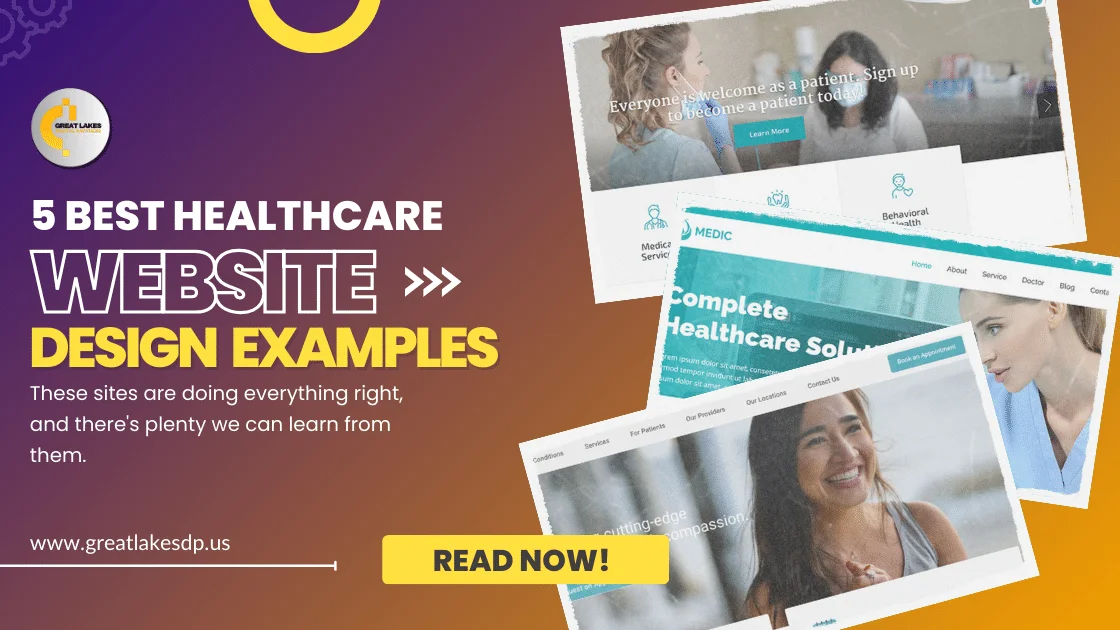
Let’s explore five stellar healthcare website examples that not only look great but also deliver an exceptional user experience. These sites are doing everything right, and there’s plenty we can learn from them. By studying these examples, you can gain practical knowledge on how to improve your own healthcare website design.
Table of Contents
ToggleBest Healthcare Website Design Examples
1. Mayo Clinic
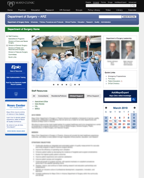
The Mayo Clinic website, a benchmark in the healthcare industry, is known for its clean, user-friendly interface. Mayo Clinic, a name synonymous with cutting-edge medical research and patient care, has successfully translated its reputation into an impressive online presence. Designed by a reputable website development company in USA, the site offers a wealth of information, ranging from disease prevention tips to detailed explanations of complex medical conditions, all presented in a manner that is both accessible and engaging. The design is straightforward yet sophisticated, reflecting the institution’s commitment to excellence.
Key Features
- Intuitive Navigation: The website’s structure is straightforward, allowing users to quickly find what they need, whether it’s medical information, scheduling appointments, or finding a doctor.
- Search Functionality: An advanced search feature helps users easily locate specific health topics, services, or doctors.
- Responsive Design: The site is fully responsive, ensuring a seamless experience across all devices, from desktops to smartphones.
Why It Works
Mayo Clinic’s site exemplifies effective medical website design by prioritizing user experience. The clean layout, coupled with comprehensive information and easy navigation, makes it a go-to resource for patients.
2. Cleveland Clinic
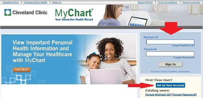
Cleveland Clinic’s website is another standout example of excellent healthcare website design. As one of the leading medical institutions in the United States, Cleveland Clinic has created an online platform that is as impressive as its physical facilities. The website seamlessly combines modern aesthetics with practical functionality, ensuring that patients and visitors can find the information they need quickly and easily. From its homepage, which welcomes users with a blend of calming visuals and concise information, to its deep, informative content, Cleveland Clinic’s site is a model of digital excellence.
Key Features
- Visual Appeal: High-quality images and a modern design aesthetic create an engaging user experience.
- Patient Resources: Easy access to patient resources, including scheduling, billing, and patient portals.
- Interactive Elements: Features like symptom checkers and interactive maps enhance user engagement.
Why It Works
The blend of visual appeal and practical resources ensures that Cleveland Clinic’s website not only looks good but also effectively serves its purpose. This balance is critical in healthcare website design, where both form and function are essential.
3. Johns Hopkins Medicine
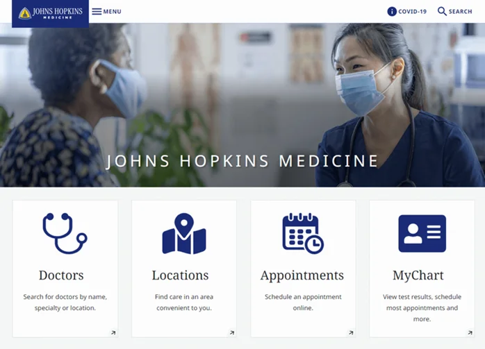
Johns Hopkins Medicine’s website is a prime example of how extensive information can be organized effectively without overwhelming the user. Known globally for its contributions to medical research and education, Johns Hopkins has crafted a website that mirrors its prestigious reputation. The site offers a wealth of detailed medical information, making it an invaluable resource for both patients and healthcare professionals. Despite the vast amount of data available, the medical website’s design ensures that everything is easily accessible, thanks to thoughtful categorization and a user-friendly interface.
Key Features
- Comprehensive Information: The website offers detailed information on diseases, conditions, treatments, and research, catering to both patients and healthcare professionals.
- Accessibility: Features like language translation and text resizing make the site accessible to a wider audience.
- Educational Content: High-quality videos and articles provide valuable educational content.
Why It Works
Johns Hopkins Medicine excels by providing a vast amount of information in a digestible format. The focus on accessibility and education underscores the institution’s commitment to patient care and knowledge dissemination.
4. Mount Sinai Health System
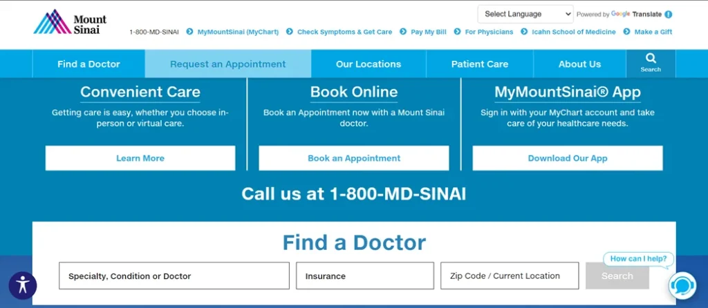
Mount Sinai Health System’s website stands out for its patient-centric approach and modern design elements. Mount Sinai, a leading healthcare provider in New York City, has created an online presence that reflects its dedication to patient care and innovation. This medical website’s design is both clean and sophisticated, with a strong emphasis on user experience. From the moment visitors land on the homepage, they are greeted with clear navigation options and immediate access to essential services like appointment scheduling and patient portals.
Key Features
- User-Centric Design: Features like online appointment scheduling, patient portals, and clear calls-to-action enhance the user experience.
- Modern Aesthetics: Clean lines, ample white space, and high-quality imagery make the site visually appealing.
- Content Organization: Information is well-organized, making it easy for users to find what they need.
Why It Works
Mount Sinai Health System’s focus on user-centric design and modern aesthetics makes it a prime example of effective medical website design. The ease of use and visually appealing layout contribute to a positive user experience.
5. Kaiser Permanente
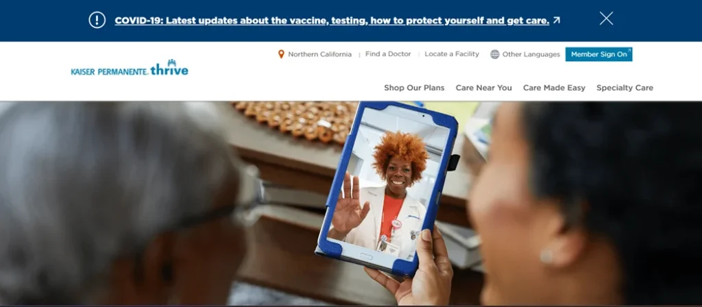
Kaiser Permanente’s website is a great example of how to integrate functionality with aesthetics in healthcare website design. As one of the largest managed care organizations in the United States, Kaiser Permanente has developed an online platform that caters to the needs of a diverse patient base. The site features a clean, modern design that is both visually appealing and highly functional. Personalized content, practical tools, and engaging resources ensure that visitors find the site useful and informative, whether they are seeking medical advice, booking appointments, or managing their health plans.
Key Features
- Personalized Experience: The website offers personalized content based on user location and preferences.
- Comprehensive Tools: Features like health calculators, symptom checkers, and appointment schedulers provide practical tools for users.
- Patient Engagement: The site includes resources like wellness articles and health tips to keep users engaged.
Why It Works
Kaiser Permanente’s website successfully combines functionality with a personalized user experience. This approach not only helps users find relevant information quickly but also keeps them engaged with the site.
The Take Away
These five healthcare website design examples demonstrate the importance of balancing aesthetic appeal with functional excellence. Whether it’s intuitive navigation, comprehensive resources, or user-centric features, each site offers valuable insights into what makes a healthcare website successful.
Remember, a well-designed healthcare website isn’t just a digital presence—it’s an extension of your commitment to patient care and engagement. By investing in top-notch website design, you’re ensuring that your patients have access to the information and resources they need right at their fingertips.
Looking to Revamp Your Healthcare Website?
If you’re inspired by these examples and considering a redesign for your healthcare website, Great Lakes DP is here to help. Trusted as the best website development company in the USA, our team specializes in offering user-friendly, visually appealing, and highly functional healthcare website design and development.
Contact us today to transform your online presence and provide your patients with the best digital experience possible.

